About
Most of the Time serie database have also a visualization tool.
75% of business graphs display time series data.
The visual representation of the full year with four seasons can be seen:
- as a box,
- as a straight line
- or as a circle.
The visual mapping of time may be different across individuals.
Articles Related
List
Chart
- Horizon Chart - Time Serie comparison
Ggplot
Data Visualisation - Histogram (Frequency distribution)
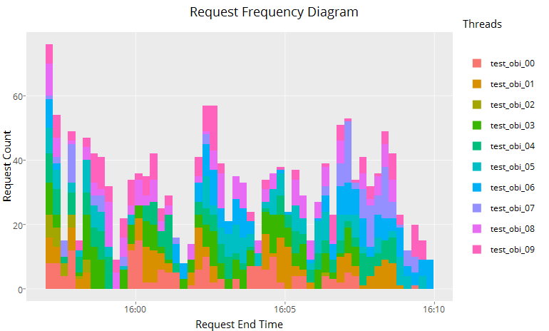
- Request Time Histogram Diagram
# Transform the text as a POSIXct type
end_ts_time=as.POSIXct(res_succes$END_TS, format="%Y-%m-%d %H:%M:%S", tz="UTC")
# Show it (User name is the thread name)
ggplotly(ggplot(res_succes, aes(x=end_ts_time, fill=factor(res_succes$USER_NAME)) )
         + geom_histogram() # by default the value is stacked by fill (position="stack")
         + scale_x_datetime()
         + labs(title="Request Frequency Diagram", fill="Threads", x="Request End Time", y="Request Count"))
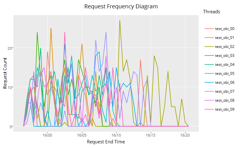
- Request Time Frequency Diagram
end_ts_time=as.POSIXct(res_succes$END_TS, format="%Y-%m-%d %H:%M:%S", tz="UTC")
ggplotly(ggplot(res_succes, aes(x=end_ts_time, color=factor(res_succes$USER_NAME)) )
         + geom_freqpoly(binwidth = 30)
         + scale_x_datetime()
         + labs(title="Request Frequency Diagram", color="Threads", x="Request End Time", y="Request Count"))
Library
| Application Name | Technology | Store |
|---|---|---|
| Cubism | D3 - Javascript written by Mike Bostock showing horizon charts | Only Viz |
| Grafana | Only Viz | |
| Graphite | Store and Viz | |
| Rickshaw | Time Serie Built on d3.js | Only Viz (Demo) |
| http://dygraphs.com/ | Time Serie specialized Used by Netdata | Demo |
See also:
- Grapht Explorer add tags to the metrics and integrating it with elasticsearch.
- http://www.cacti.net/ (Only for RRDTool)