Bootstrap - AutoCompletion with DropDown
About
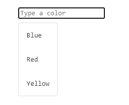
This page shows how to create a autocompletion box with the dropdown component of Bootstrap.
This is an adaptation of the autocompletion box code to the Bootstrap styling.
Steps
Read the basic
You need to know the basic of an autocompletion box.
If you don't know how it works under the hood, read this article: How to create an Autocompletion functionality with CSS , Javascript and HTML ?
The box and its container
The container of dropdown box on Bootstrap 1) is a div box with:
<div class="dropdown">
  <input
      type="text"
      class="form-control"
      id="color-input"
      placeholder="Type of color"
      autocomplete="off"
      >
      <ul class="dropdown-menu"><!-- Build dynamically --></ul>
</div>
The dynamic building of the list
We just reuse the function that creates the autocompletion list of the original article.
The adaptation are:
- the list item class in bootstrap is dropdown-item
- you add/remove the show class.
The code:
- The possible values that you can fetch via api
let colors = ["Blue","Red","Yellow"];
- The function that rebuild the list (listElement) with the searchTerm for the inputBox
function rebuildAutoCompletionList(searchTerm, listElement, inputBox){
   console.log(`filtering value ${searchTerm}`);
   /* Reset the content */
   listElement.innerHTML="";
   /* No search term */
   if(searchTerm==""){
      return;
   }
   /* Filtering of the data */
   let pattern = new RegExp(`.*${searchTerm}.*`,"i");
   let selectedColors = colors.filter(e=>pattern.test(e));
   if (selectedColors.length==0){
     return;
   }
   /* Creation of the bootstrap autocompletion list item */
   for(color of selectedColors){
        let li = document.createElement("li");
        /* To be able to determine that an item was clicked */
        li.classList.add("dropdown-item");
        /* We make li focusable to get on the relatedTarget it when we click  */
        li.setAttribute("tabindex","0");
        li.innerText = color;
        /* When the element is clicked, set the value of the search Box */
        li.addEventListener("click", function(){;
             if (inputBox != undefined){
                /* Set the value in the input box */
                inputBox.value = this.innerText;
                /* Remove the list */
                listElement.classList.remove("show");
             } else {
               console.log(`No input box defined, the selected value was ${this.innerText}`);
             }
        });
        listElement.append(li);
   }
}
The elements
The elements used in javascript later
- The input element
let inputBox = document.getElementById("color-input");
- The list root element (ie ul)
let completionListRoot = document.querySelector("#color-input ~ .dropdown-menu");
InputBox: On focus, on blur
- On focus, create the autocompletion list and add the show class
- On Blur, delete the show class
inputBox.addEventListener("focus", function(){

    /* on focus, create the list */
    rebuildAutoCompletionList(".*",completionListRoot,this);
    completionListRoot.classList.add("show");

    /* on blur, delete it */
    inputBox.addEventListener("blur", function(event){
        /* blur can also happen when we click on a list item, we don't remove the list in this case */
        if (event.relatedTarget == null ||
           (event.relatedTarget  !=null && !event.relatedTarget.classList.contains("dropdown-item"))){
           completionListRoot.classList.remove("show");
        }
    });
});
InputBox: On value change
On change we rebuilt the list
inputBox.addEventListener("input", function(){
    let searchTerm = this.value;
    if (this.value==""){
       searchTerm = ".*";
    }
   rebuildAutoCompletionList(searchTerm,completionListRoot,this);
});
Output
The result is:
