CSS - (Device) Pixel Ratio (DPR)
About
The device pixel ratio (also called CSS Pixel Ratio) is what determines how a device's screen resolution is interpreted by the browser and also by CSS.
The device pixel ratio is the ratio between:
Articles Related
Formula
A browser's CSS calculates a device's logical (or interpreted) resolution by the formula: <MATH> \text{(Logical or CSS) Screen Resolution} = \frac{\displaystyle \text{(Physical or Device) Resolution}}{\displaystyle \text{Device Pixel Ratio}} </MATH>
Javascript
You can get the calculated via the window property devicePixelRatio
console.log("The device pixel ratio for this browser is: "+window.devicePixelRatio);
If you take the browser in mobile mode (smaller viewport), you could also see a value of 3 in place of 1 because the browser emulate the mobile screen.
Usage
Font Size
Effect of device-pixel-ratio on font size
| device-pixel-ratio | font size |
|---|---|
| 1 | 16px |
| 1.5 | 24px |
| 2 | 32px |
Responsive Image
The device pixel ratio is also used by the browser in the calculation of the best image to download via the srcset img attribute allowing image to be responsive.
Example
Formula Calculation for Apple iPhone 6s
<MATH> \text{Logical Screen Resolution} = \frac{\displaystyle 750 \text{ x } 1334}{\displaystyle 2} = 375 \text{ x } 667 </MATH>
CSS will think the device has a 375×667 resolution screen and Media Queries will respond as if the screen is 375×667. But the rendered elements on the screen will be twice as sharp as an actual 375×667 screen because there are twice as many physical pixels in the physical screen.
Ratio by Device
| Nokia Lumia 1020 | 1.6667 |
| Samsumg Galaxy S4 | 3 |
| Apple iPhone 6 Plus | 2.46 |
Source: DPI Love
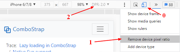
Emulate with Devtool
The browser devtool permits to change and emulate this property.
Example with chrome