CSS flex-flow property

Css Flex Align Content

CSS - Flex - Flex Flow

About

flex-flow is a css shorthand notation that takes as value:

Example multi-line container

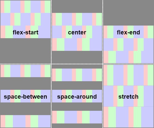
Note: This three examples are based on a row of div an shows the effect of the flex-flow value.

They just differs in their flex-flow value.

They share all:

  • the same HTML:
<div class="flex">
  <div class="item">1</div>
  <div class="item">2</div>
  <div class="item">3</div>
  <div class="item">4</div>
</div>
  • The same css for the first div container and the item children.
.flex {
  display: flex;
  width: 300px;
  margin:2rem;
}
.item {
  width: 80px;
  background-color: SkyBlue;
  border: 1px solid #e7e7e7;
  text-align: center;
  box-sizing: border-box;
  height: 20px;
}

row wrap

.flex {
  flex-flow: row wrap;
}

row-reverse wrap-reverse

.flex {
  flex-flow: row-reverse wrap-reverse;
}

column wrap

.flex {
  flex-flow: column wrap;
  width: 160px;
  height: 60px; 
  box-sizing: border-box;
}

Documentation / Reference


Discover More
Css Flex Align Content
CSS - Flex Box

flex is a layout model that lays out object in a single axis focused on space distribution and content alignment. flex means: flexible layout as flexible size Flex layout is superficially similar...
Css Flex Align Content
CSS Flex - flex-direction (row or column)

The flex-direction layout the children of a flex container in: row or column column layout flex-direction is part of what's called the flex-flow. This three examples are based on a row of div...
Css Flex Align Content
Flex - flex-wrap (Single Line or Multi-Line)

A flex container can be either single-line or multi-line, depending on the flex-wrap property. flex-wrap: nowrap: (Default)A single-line flex container lays out all of its children in a single line,...


Share this page:
Follow us:
Task Runner