About
flex is a layout model that lays out object in a single axis focused on space distribution and content alignment.
flex means:
- flexible layout
- as flexible size
Flex layout is superficially similar to block layout. It lacks many of the more complex text- or document-centric properties that can be used in block layout, such as:
- and columns.
A flex container is the box generated by an element with a computed display of:
- flex:
- items have equal height
- auto margin are working to push item to top or bottom
- vertical-align has no effect on a flex item.
- or inline-flex.
In-flow children of a flex container are called flex items and are laid out using the flex layout model.
flex is good choice to achieve uniform sizing across several element. Example Card groups
Axis:
- main-(axis|dimension|wise) - determined by the flex-direction (default to horizontal (ie row) and not vertical (ie column))
- cross-(axis|dimension|wise) / 90 degree from the main-axis
Feature
- columns without a specified width automatically layout as equal width columns
| Features Description | Property |
|---|---|
| Flow direction (leftwards, rightwards, downwards, or even upwards!) | The flex-direction property |
| Display order reversed or rearranged at the style layer (i.e., visual order can be independent of source and speech order) | order |
| Single line (main) or wrapped into multiple lines along a secondary (cross) axis | Flex - flex-wrap (Single Line or Multi-Line) |
| “flex” sizes (respond to the available space, either growing to fill unused space or shrinking to avoid overflowing the parent) | the flex property |
| Alignment with respect to their container or each other on the secondary (cross) | align |
| Collapse or uncollapse dynamically along the main axis while preserving the container’s cross size | margin and justify-content |
Property
flex-flow = flex-direction (row, column) + flex-wrap (Single or multi-line)
Order
The CSS order property specifies the visual order used to lay out flex items in their flex container. Elements are laid out in the ascending order of the order value. Elements with the same order value are laid out in the order in which they appear in the source code.
/* Numerical value including negative numbers */
order: 5;
order: -5;

/* Global values */
order: inherit;
order: initial;
order: unset;
Example
<div id='main'>
   <article>1 - Article</article>
   <nav>2 - Nav</nav>
   <aside>3 - Aside</aside>
</div>
#main { display: flex;  text-align:center; padding: 2rem; width: 100%; box-sizing: border-box; background-color: #aedcef;}
#main > article { order: 2; background-color: DeepSkyBlue; padding: inherit; flex:1; }
#main > nav     { order: 1; background-color: AliceBlue; padding: inherit; }
#main > aside   { order: 3; background-color: CadetBlue; padding:inherit; }
Flex Property - Length definition (flex-grow, flex-shrink, flex-basis)
justify-content (horizontal distribution)
justify-content will distribute the object along the main axis
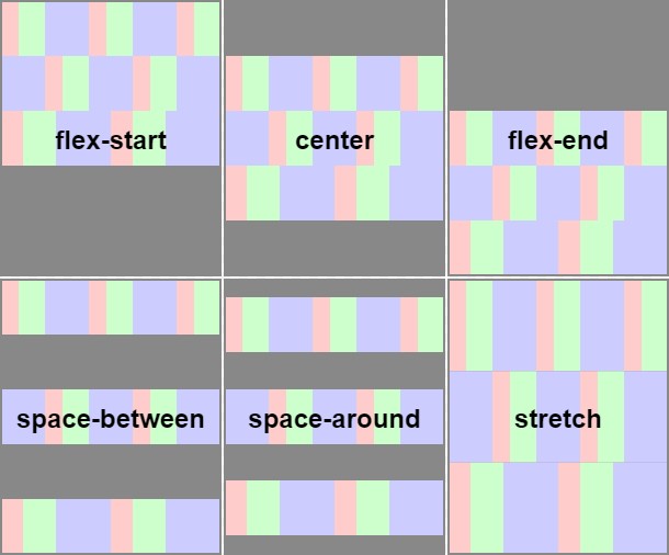
align-items (vertically)
An illustration of the five align-items keywords and their effects on a flex container with four colored items.
To apply align-items, height should be applied to the container.
align-content
An illustration of the align-content keywords and their effects on a multi-line flex container See flex-wrap (Svg source)
Documentation / Reference
- https://drafts.csswg.org/css-align-3 - new specification for all layout model