CSS - Grid
About
grid 1)is a CSS layout system that provides a mechanism:
- to divide the available space into columns and rows (two-dimensional grid)
- to position into one or more intersections an html element (known as grid item)
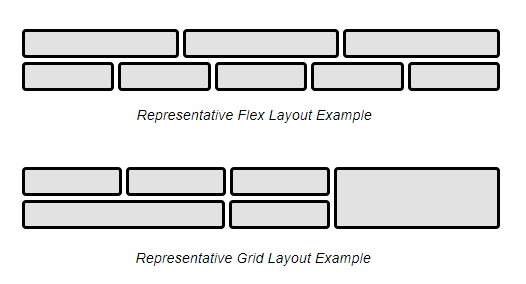
With grid, you can easily defines layout that requires horizontal and vertical alignment such as the below form2)
Feature
- Two axis location (Flex has only one)
- Space distribution is two dimensional (Flex focuses on space distribution within an axis)
- The position of the item inside the layout can change by media query
- Area can overlap and layer, similar to CSS positioned elements.
Concept
Container
A grid container 4) is the container element that has the display value set to:
#grid  {
  display: grid;
}
It contains the grid.
Grid
The grid is defined 7) with the following three properties:
- grid-template-rows,
- grid-template-columns,
- and grid-template-areas
They define the grid of a grid container by specifying its explicit grid tracks.
The grid property 8) is a shorthand that sets all of three explicit grid properties
Example: the following grid declares a grid with :
- four named areas: H, A, B, and F.
- the first column sized to fit its contents (auto),
- the second column taking up the remaining space (1fr).
- rows default to auto (content-based) sizing;
- the last row given a fixed size of 30px.
main {
  grid: "H    H "
        "A    B "
        "F    F " 30px
  /     auto 1fr;
}
Area
A grid area 9) is a logical space name:
- that maps a name to one or more cell
- where grid items may be positioned
The grid area are defined using:
- the grid-template-areas 10) property
- or the grid shorthand
Example:
- The below statement defined:
- two areas: area1 and area2
- and their space in the grid (ie mapping to grid cells)
#grid  {
  display: grid;
  grid-template-areas: ". area1"
                       "area2 area1"
                       ". area1";
}
- The following declares a grid with:
- three rows and 5 evenly-sized columns
- the middle row taking up all remaining space (and at least enough to fit its contents).
main {
  grid: auto 1fr auto / repeat(5, 1fr);
  min-height: 100vh;
}
Positioning
You can specify the position where the element should go, using :
| Longhand properties | shorthand equivalent | full shorthand equivalent |
|---|---|---|
| grid-row-start grid-row-end 11) | grid-row 12) | grid-area 13) |
| grid-column-start grid-column-end 14) | grid-column 15) | grid-area 16) |
- The number unit is the line number. ie 2 means the line 2
- The value auto will place the item into the next available empty grid cell (growing the grid if there’s no space left) driven by the auto-placement algorithm.
- It's possible to position absolutely an item inside its area in the grid 17)
Example:
| Placement | grid-area | grid-row, grid-column | grid-row-start/end, grid-column-start/end |
|---|---|---|---|
| Place into named grid area a |
|
|
|
| Auto-place into next empty area |
|
| |
| Place into row 2, column 4 |
|
| |
| Place into column 3, span all rows |
|
|
|
| Place using named lines |
|
|
In css, you would apply them in rule block. Example in a 2 columns x 3 rows.
#stats    { grid-column: 1; grid-row: 2; align-self: start; }
#controls { grid-column: 2; grid-row: 3; justify-self: center; }
Sizing
Sizing a grid means sizing the tracks. See the tracks definition section to know how to size a grid.
Item
The grid item 19) are:
- the boxes
- of the grid child items (placed or not)
- representing the grid in-flow contents
- that are positioned in the grid
As of Grid level 1, only the direct children of the container become grid items and can then be placed on the grid
Cell
A grid cell 20) is the intersection of:
- a grid row
- and a grid column.
It is the smallest unit of the grid that can be referenced when positioning grid items.
Track
Grid track 21) is a generic term for:
- a grid column
- or grid row
It's the space between any two adjacent lines on the grid.
The below properties define grid tracks:
- the grid-template-columns
- and grid-template-rows properties. .
They controls how wide or tall the column or row may grow.
The sizing calculation is done by the grid sizing algorithm
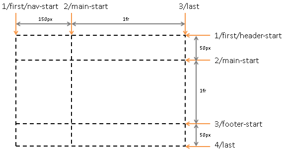
Example of a Grid with two columns and three rows. 22)
#grid {
  display: grid;
  grid-template-columns: 150px 1fr;  /* two columns */
  grid-template-rows: 50px 1fr auto; /* three rows  */
}
where:
- Columns:
- The first column is fixed at 150px.
- The second column uses flexible sizing (It will take the remaining available width space of the grid container). Example:
- If the grid container is 200px wide, the second column is 50px wide.
- If the grid container is 100px wide, the second column is 0px (any content in the column will overflow)
- Rows:
- The first row is fixed at 50px.
- The second column is flexible
- The third column sized to content
- The only rows and columns that will grow or shrink are not set with a fix length or auto value.
- This same properties can be used to give a name to a line
- The grid layout is a content-based minimum sizing (ie the min-width and min-height are set to auto) and therefore it may lead to an overflow. See this dedicated page for a detailed explanation: How to solve a CSS grid overflow ?.
Line
grid lines can be referred to by:
- their numerical index,
- their name (Multiple lines with the same name establish a named set of grid lines)
The following code 23) names the lines in the grid with the sizing properties. (Some of the lines have multiple names)
#grid {
  display: grid;
  grid-template-columns: [first nav-start] 150px [main-start] 1fr [last];
  grid-template-rows: [first header-start] 50px [main-start] 1fr [footer-start] 50px [last];
}
Alignement / Space Distribution
The sized grid is aligned 24) 25) according to the grid container’s:
- align-content
- and justify-content properties.
Example:
- Example 1:
- the grid is centered vertically, and aligned to the right edge of its grid container
.grid {
  display: grid;
  grid: 12rem 12rem 12rem 12rem / 10rem 10rem 10rem 10rem;
  justify-content: end;
  align-content: center;
}
- Example 2:
- justifies all columns by distributing any extra space among them,
- centers the grid in the grid container when it is smaller than 100vh.
main {
  grid: auto-flow 1fr / repeat(auto-fill, 5em);
  min-height: 100vh;
  justify-content: space-between;
  align-content: safe center;
}
Overflow
The content may overflow if the cells in a grid are Block|.
One solution is to set the cell to a grid display with an autoflow to row.
display: grid;
grid-auto-flow: row;
Span
By default, a grid item has a span of 1. 26)
Different spans can be given explicitly:
- Starts in the 2nd row, spans 5 rows down (ending in the 7th row).
.three {
  grid-row: 2 / span 5;
}
- Ends in the 7th row, spans 5 rows up (starting in the 2nd row).
.four {
  grid-row: span 5 / 7;
}
- Span from line “first” to line “middle”.
.five {
  grid-column: first / middle;
}
- Span between the 5th and 7th lines named “text”. (Multiple lines with the same name establish a named set of grid lines)
.six {
  grid-row: text 5 / text 7;
}
Media Query
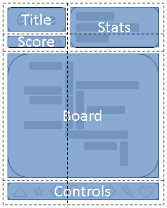
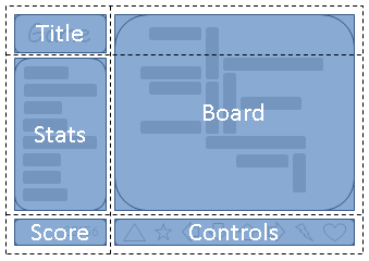
This example 27) shows how it's possible to change the layout with different media query.
@media (orientation: portrait) {
  #grid {
    display: grid;
    grid-template-areas: "title stats"
                         "score stats"
                         "board board"
                         "ctrls ctrls";
    ...
  }
}
@media (orientation: landscape) {
#grid {
    display: grid;
    /* Different positions in the layout */
    grid-template-areas: "title board"
                         "stats board"
                         "score ctrls";
    ...
  }
}
Float
floating is ignored
Unit
- Number are line number
- 1fr represents a 1 fraction of the leftover space in the grid container. 28)
Overflow
See How to solve a CSS grid overflow ?
Devtool visualization
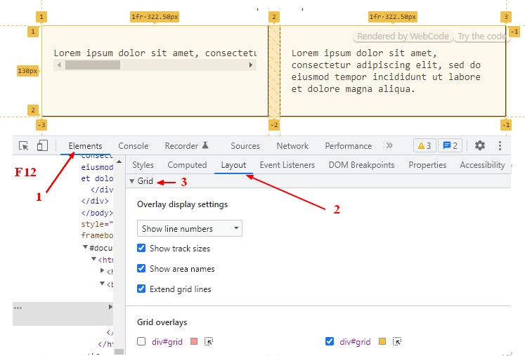
The browser devtool have option to visualize the grid.
For instance, on chrome:


