
How works CSS grid Auto-placement ?
About
- will place the Css grid item into the next available empty grid cell (growing the grid if there’s no space left)
- is driven by the placement algorithm 2)
- is controlled by the grid-auto-flow property 3)
- rows: grow the grid by adding rows
- columns: grow the grid by adding columns
- dense: grow the grid by adding rows or columns to make the grid dense.
This is the default grid behavior if the placement is not defined
Example: Form auto-placed
In this example, the grid-auto-flow property is row which instructs the grid to search across its 3 columns starting with the first row, then the next, adding rows as needed until sufficient space is located to accommodate the position of any auto-placed grid item.
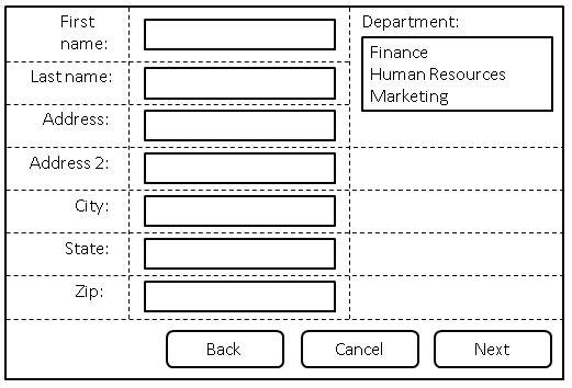
- Define a three columns grid for the form
- with the line name: labels, controls and oversized
- all content-sized (auto)
form {
  display: grid;
  grid-template-columns: [labels] auto [controls] auto [oversized] auto;
  grid-auto-flow: row dense;
  max-width: 520px;
}
- Place all labels in the “labels” column and automatically find the next available row.
form > label {
  grid-column: labels;
  grid-row: auto;
}
- Place all controls in the controls column and automatically find the next available row.
form > input, form > select {
  grid-column: controls;
  grid-row: auto;
}
- Auto place this item in the “oversized” column in the first row where an area that spans three rows won’t overlap other explicitly placed items or areas or any items automatically placed prior to this area.
#department-block {
  grid-column: oversized;
  grid-row: span 3;
}
- Place all the buttons of the form in the explicitly defined grid area.
#buttons {
  grid-row: auto;
  /* Ensure the button area spans the entire grid element in the inline axis. */
  grid-column: 1 / -1;
  text-align: end;
}
<form>
  <label for="firstname">First name:</label>
  <input type="text" id="firstname" name="firstname" />
  <label for="lastname">Last name:</label>
  <input type="text" id="lastname" name="lastname" />
  <label for="address">Address:</label>
  <input type="text" id="address" name="address" />
  <label for="address2">Address 2:</label>
  <input type="text" id="address2" name="address2" />
  <label for="city">City:</label>
  <input type="text" id="city" name="city" />
  <label for="state">State:</label>
  <select type="text" id="state" name="state">
    <option value="WA">Washington</option>
  </select>
  <label for="zip">Zip:</label>
  <input type="text" id="zip" name="zip" />

  <div id="department-block">
    <label for="department">Department:</label>
    <select id="department" name="department" multiple>
      <option value="finance">Finance</option>
      <option value="humanresources">Human Resources</option>
      <option value="marketing">Marketing</option>
    </select>
  </div>

  <div id="buttons">
    <button id="cancel">Cancel</button>
    <button id="back">Back</button>
    <button id="next">Next</button>
  </div>
</form>
- Output:
Auto created tracks (column or row) Sizing
Implicit tracks are tracks (rows/columns) that are not explicitly defined but created because of the auto placement
These implicit tracks are sized by:
Span
Auto-placement can be combined with an explicit span, if the item should take up more than one cell.
/* Auto-placed item, covering two rows and three columns. */
.nine {
  grid-area: span 2 / span 3;
}