CSS Flex - flex-direction (row or column)
About
The flex-direction layout the children of a flex container in:
- row
- or column
The block layout have also column layout
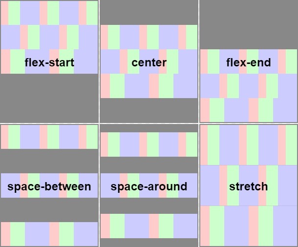
flex-direction is part of what's called the flex-flow.
Example
This three examples are based on a row of div an shows the effect of the flex-direction value.
Note: The examples share this HTML and CSS to create a row of cells.
- the same HTML (a container with a serie of cell)
<div class="flex">
  <div class="item">1</div>
  <div class="item">2</div>
  <div class="item">3</div>
  <div class="item">4</div>
</div>
- The same css:
- for the first div container: a flex
- for the item children, a box
.flex {
  display: flex;
  margin:2rem;
}
.item {
  width: 80px;
  height: 20px;
  background-color: SkyBlue;
  border: 1px solid #e7e7e7;
  text-align: center;
  box-sizing: border-box;
}
default: row
The default value is to layout as row the children.
The width is not taken into account. If you want, you should set the flex-wrap property.
.flex {
  width: 300px;
}
row
.flex {
  flex-direction: row;
}
column
.flex {
  flex-direction: column;
}