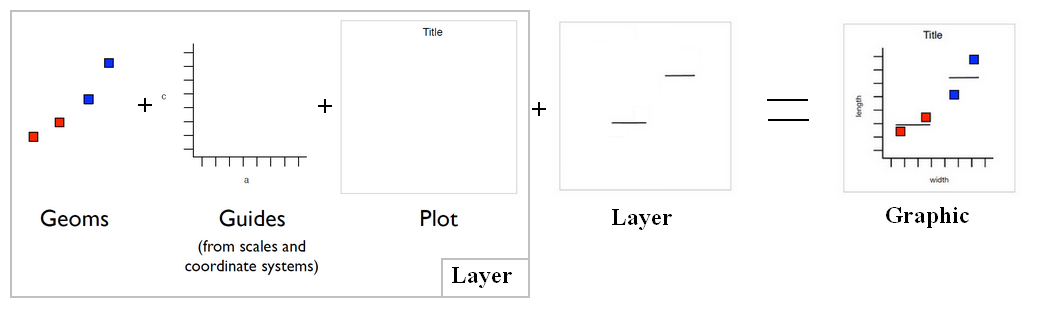
Ggplot - Histogram (geom_histogram, geom_freqpoly)

Ggplot Graphic Plot

About

Data Visualisation - Histogram (Frequency distribution)

Example

Numeric

R - (Numeric|Double) Vector

library(ggplot2)
library(plotly)
histoTotalTime = ggplot(res_succes, aes(res_succes$TOTAL_TIME_SEC)) + 
  geom_histogram(bins = 100) + 
  labs(x = "Query Time (Sec)", y = "Number of Query") 

ggplotly(histoTotalTime)
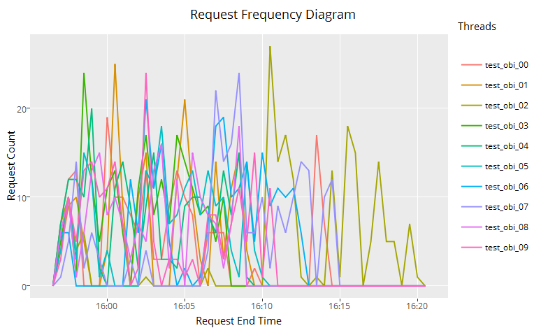
Time

R - Date Time (POSIXct)

end_ts_time=as.POSIXct(res_succes$END_TS, format="%Y-%m-%d %H:%M:%S", tz="UTC")
ggplotly(ggplot(res_succes, aes(x=end_ts_time, color=factor(res_succes$USER_NAME)) ) 
         + geom_freqpoly(binwidth = 30)
         + scale_x_datetime()
         + labs(title="Request Frequency Diagram", color="Threads", x="Request End Time", y="Request Count"))

Ggplot Request Frequency Diagram

Formula

Breaks definition

The below code handles outliers by:

  • creating manually the breaks
  • limiting the Cartesian coordinates (zooming)
## Create bin breaks
value_breaks = c( seq(10,120,by=10), max(res_succes$TOTAL_TIME_SEC))
## Labels
label_breaks = c(as.character(seq(10, 120, by=10)), "Max+")

ggplot(res_succes, aes(x=res_succes$TOTAL_TIME_SEC, fill = factor(res_succes$REPORT_TYPE))) +
  geom_histogram(breaks=value_breaks) +
  labs(x = "Total Time (min)", fill= "Report Type") +
  coord_cartesian(xlim=c(10,130)) +
  scale_x_continuous(breaks=value_breaks, labels=label_breaks)


Discover More
Utah Teapot
Data Visualisation - Histogram (Frequency distribution)

A histogram is a type of graph generally used to visualize a distribution An histogram is also known as a frequency distribution. Histograms can reveal information not captured by summary statistics...
Ggplot Graphic Plot
GGplot - Stat - (Statistical transformation|Statistic)

The Statistical transformation (stat). Multiple layers, statistical transformation. It's often useful to transform your data before plotting, and that's what statistical transformations do. Every...
Ggplot Graphic Plot
Ggplot - Bars, rectangles with bases on x-axis (Geom_bar)

A bar geom makes the height of the bar proportional to: the number of cases in each group (default) or the sum of a column (using the weight aesthetic) The geom_bar layer is used to produce 1d area...
R Histogram
R - Histogram

How to make histogram in R. plot“” You can use the layout function in order to have more than one histogram by page. Example: See : Histogram: Geom: bar Stat: bin Scale: linear...


Share this page:
Follow us:
Task Runner