About
A radio represents a serie of mutually-exclusive choices in a form.
It is an input element of type radio.
A radio is round to distinguish from the square checkbox.
Management
State
As the checkbox, the state of the radio buttons is managed by the boolean value of the checked attribute.
<form>
    <p>Pizza crust:</p>
    <p>
        <input type="radio" name="choice" value="regular" >
        <label for="choice1id">Regular crust</label>
</p>
<p>
    <input type="radio" name="choice" value="deep" checked >
    <label for="choice2id">Deep dish</label>
</p>
- To get the value with a formData object
let formData = new FormData(document.querySelector("form"));
console.log(`The actual value is: ${formData.get("choice")}`);
If no input element is checked, the control is not complete and no key/value will be send on submit.
Event
A radio modification can be captured with the change event
Demo:
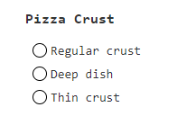
- A serie of radio input with the same name (ie choice) and different value
<p>Pizza crust:</p>
<p>
    <input type="radio" name="choice" value="regular" onchange="return handleChange(this);">
    <label for="choice1id">Regular crust</label>
</p>
<p>
    <input type="radio" name="choice" value="deep" onchange="return handleChange(this);" checked>
    <label for="choice2id">Deep dish</label>
</p>
<p>
    <input type="radio" name="choice" value="thin" onchange="return handleChange(this);">
    <label for="choice2id">Thin crust</label>
</p>
- to handle the change event
let handleChange = (element) => {
   console.log("The pizza crust chosen is "+element.value);
}
Styling / CSS
- To style the below radio buttons:
<input type="radio"  name="color" value="blue" checked/>
<input type="radio"  name="color" value="red"/>
- first disable the browser styling
input[type="radio"] {
  appearance: none;
}
- Then make you own.
- Styling for Checked or unchecked radio
input[type="radio"] {
  width: 2rem;
  height: 2rem;
  border-radius: 2em;
  border: 1px solid rgba(0,0,0,.25);
  background-color: #20c997;
  border-color: #20c997;
}
- Styling when checked, with the checked pseudo class
input[type="radio"]:checked {
  background-image: url("data:image/svg+xml,%3csvg xmlns='http://www.w3.org/2000/svg' fill='%23fff' viewBox='0 0 16 16'%3e%3cpath d='M10.97 4.97a.75.75 0 0 1 1.07 1.05l-3.99 4.99a.75.75 0 0 1-1.08.02L4.324 8.384a.75.75 0 1 1 1.06-1.06l2.094 2.093 3.473-4.425a.267.267 0 0 1 .02-.022z'/%3e%3c/svg%3e");
}
- Output:
Aria
Programmatic example for aria role, css and javascript1). Just try the code to see it entirely.
<div role="radiogroup" aria-labelledby="gdesc1">
  <h3>Pizza Crust</h3>
  <div role="radio" aria-checked="false" tabindex="0">Regular crust</div>
  <div role="radio" aria-checked="false" tabindex="-1">Deep dish</div>
  <div role="radio" aria-checked="false" tabindex="-1">Thin crust</div>
</div>
- the visuals for the radio buttons
Key
Because a radio is an input element, it's focusable meaning that the arrow keys (up down, left, right) change the selection.