About
Checkbox is a type of input element that will add its name and value to the form data only if checked (making it a succesful control)
The HTML checkbox form control can only have two checked states (via its checked attribute):
- checked (checked=true)
- or not checked (checked=false)
If you want to get always a value for a property (ie false or true), you can:
- use a radio.
- or add a hidden input field via javascript if unchecked
Base Demo
This demo shows that if the checkbox is checked, the property given by the name attribute (with value property-name) will be added to the data send by the form with the default value of on
- The HTML: A checkbox with the mandatory name (property-name)
<form>
    <input type="checkbox" name="property-name"  />
    <button type="submit">Submit</button>
</form>
- Test it:
- Uncheck and submit
- Check and submit
Syntax
The syntax of a checkbox is:
<input type="checkbox" name="propertyName" value="propertyValue" checked="false|true"/>
where:
- input is the input element
- value is an optional attribute (default to on) that sets the value of the property send
- checked is the optional checked attribute (default to false) that sets the state of the checkbox (How to change it programmatically)
Value
If a checkbox is unchecked when its form is submitted, the field data is just not sent.
There is no not-checked value
Default
The default value is on and never changes.
Demo:
- The HTML
<input type="checkbox" name="indicator"/>
- The javascript with an click event listener
document.querySelector("input").addEventListener("click", function(){
   console.log(`The checkbox is checked ? ${this.checked}`);
   console.log(`The value is ${this.value}`);
});
- Checking or unchecking the checkbox does not change the value
If Set
If the value attribute is set, this value will be send instead
Demo:
- The HTML with a checkbox with a mandatory name and a custom value
<form>
    <input type="checkbox" name="indicator" value="customValue" />
    <button type="submit">Submit</button>
</form>
- This javascript:
document.querySelector("form").addEventListener("submit", function(event){
   event.preventDefault();
   let formData =  new FormData(this);
   let i = 0;
   for (let entry of formData) {
      i++;
      console.log(`Entry ${i}`);
      console.log(entry);
   }
   console.log(`Number of field sent: ${i}`);
});
- The result:
- Uncheck and submit
- Check and submit
Visual / Styling
Css
- To style the below checkbox:
<input type="checkbox" name="indicator" checked/>
- first disable the browser rendering
input[type="checkbox"] {
  appearance: none;
}
- Then make you own.
- Styling for Checked or unchecked checkbox
input[type="checkbox"] {
  width: 2rem;
  height: 2rem;
  border-radius: .5em;
  border: 1px solid rgba(0,0,0,.25);
  background-color: #20c997;
  border-color: #20c997;
}
- Styling when checked, with the checked pseudo class
input[type="checkbox"]:checked {
  background-image: url("data:image/svg+xml,%3csvg xmlns='http://www.w3.org/2000/svg' fill='%23fff' viewBox='0 0 16 16'%3e%3cpath d='M10.97 4.97a.75.75 0 0 1 1.07 1.05l-3.99 4.99a.75.75 0 0 1-1.08.02L4.324 8.384a.75.75 0 1 1 1.06-1.06l2.094 2.093 3.473-4.425a.267.267 0 0 1 .02-.022z'/%3e%3c/svg%3e");
}
- Output:
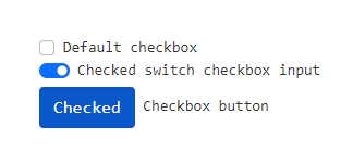
Switch
As switch 1)
<div class="form-check form-switch">
  <input class="form-check-input" type="checkbox" id="flexSwitchCheckChecked" checked>
  <label class="form-check-label" for="flexSwitchCheckChecked">Checked switch checkbox input</label>
</div>
Button
<input type="checkbox" class="btn-check" id="btn-check-2" checked autocomplete="off">
<label class="btn btn-primary" for="btn-check-2">Checked</label>
Keyboard Navigation
You may navigate with the tab key because a input (and alos checkbox) is by default focusable. You still may change the order of navigation via the tabindex value.
Example:
- if you click on the first check below
- the first tab will get you on the last one because of the tabindex of value 2
- the second tab will get you on the second checkbox because of the tabindex of value 0
- the third tab will get you on the next interactive element in the iframe (ie a link) - the code is rendered in a iframe
<input type="checkbox"  tabindex="1" />
<input type="checkbox" tabindex="0" />
<input type="checkbox" tabindex="2" />
How to
How to change the state programmatically
The checked attribute of the input checkbox element permits:
- to test the state (if true, the checkbox is checked)
- to set the state
Example
- the callback function that:
- toggle the checkmark
function toggleCheckBox(event){
  event.preventDefault();
  if (event.target.checkbox.checked){
     event.target.checkbox.checked = false;
     event.target.button.innerHTML= "Check the checkbox";
  } else {
    event.target.checkbox.checked = true;
    event.target.button.innerHTML= "Uncheck the checkbox";
  }
}
<form onSubmit="toggleCheckBox(event)">
<input type="checkbox" name="checkbox" checked="true" /></br>
<button type="submit" name="button">Uncheck the checkbox</button>
</form>
- Result:
How to use a checkbox to enable or disable other Form elements
Example of a legend with a checkbox that controls whether or not the fieldset is enabled
<form>
<fieldset name="clubfields" disabled>
 <legend> <label>
  <input type=checkbox name=club onchange="form.clubfields.disabled = !checked">
  Use Club Card
 </label> </legend>
 <p><label>Name on card: <input name=clubname required></label></p>
 <p><label>Card number: <input name=clubnum required pattern="[-0-9]+"></label></p>
 <p><label>Expiry date: <input name=clubexp type=month></label></p>
</fieldset>
</form>
- Just click the checkbox to see it in action.
Aria Role
With aria role, you need to handle programmatically the state of each attribute as seen in this example 3)
- The checkbox are rendered through the CSS content property.
- The javascript file checkbox.js handle only the HTML property of the element with a checkbox role.
The code:
- The Css
[role='checkbox'][aria-checked='false']:before{
    content: '\00a0\00a0';
    width: 14px;
    height: 14px;
    border: 1px solid hsl(0, 0%, 66%);
    border-radius: 0.2em;
    background-image: linear-gradient(to bottom, hsl(300, 3%, 93%), #fff 30%);
}

[role='checkbox'][aria-checked='true']:before{
   content: url('/_media/web/html/checkbox_checked.png');
}

[role='checkbox'].focus {
   border-color: black;
   background-color: #EEEEEE;
}
- The Javascript:
window.onload=function() {
    var checkboxes = document.querySelectorAll('[role="checkbox"]');
    for (var i = 0; i < checkboxes.length; i++) {
         var cb = new Checkbox(checkboxes[i]); cb.init();
    }
}
- The HTML (tabindex makes the div focusable (ie clickable)
<div id="ex1">
  <h3>
    Sandwich Condiments
  </h3>
  <div>
    <div role="checkbox"
       aria-checked="false"
       tabindex="0">
      Lettuce
    </div>
    <div role="checkbox"
       aria-checked="true"
       tabindex="0">
      Tomato
    </div>
    <div role="checkbox"
       aria-checked="false"
       tabindex="0">
      Mustard
    </div>
    <div role="checkbox"
       aria-checked="false"
       tabindex="0">
      Sprouts
    </div>
  </div>
</div>

<!-- With the libray call at the end -->
<!-- Checkbox widget that implements ARIA Authoring Practices for a menu of links -->
<script src="https://www.w3.org/TR/wai-aria-practices/examples/checkbox/checkbox-1/js/checkbox.js" type="application/javascript"></script>